Monday, September 25, 2006

Something Wicked- Inks and colour
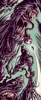
As promised, here's the inked and coloured version of the Something Wicked back cover illo I posted a couple of entries back.

As you've probably noticed, I've flipped and rotated the original pencil for the final version. This was a last minute decision after colouring, as I thought the original concept (guy falling into gaping mouth of monster) was getting a bit stale. I'm not sure if it's because I'd spent the last few days looking at it while inking and colouring but when I flipped it, it seemed a lot fresher and the flow and design worked better for me. Yeah I know, the guy's now falling up. But is he falling now or flying? Is he a victim or the hero? The ambiguous meaning of the piece and the fact that turning it upside down drastically changed the look of the creature, are two big pluses for me. Also now you can clearly see the hidden face I snuck in to the left of the open mouth. Anyway let me know what you think, which one you think works better etc.

This was inked pretty fast (A3, brushpen and 0.4 felt tip, about 2hrs...well, that's fast for me anyway), and i'm very happy with the spontaneity of the fast brushwork. Colours were a bit tougher. Originally it began as just a red monotone colour scheme, then to a fully rendered greeny-bluey colour, then a combination of the two which is pretty much what this version is, with a bit of extra tweaking. The blackness of the linework was a bit overpowering, so I lightened it slightly to a dark reddish purple.

Also here are some detail shots.

Friday, September 22, 2006

A good Head for Radio


A digital sketch of Radiohead's frontman Thom Yorke, drawn in Photoshop.

My entry for this week's Illustration Friday topic- Phobia. Thom has numerous- Claustrophobia, Thanatophobia (fear of death), Aviophobia (fear of flying) but most of all, Motorphobia (he's terrified of cars).

Something Wicked...

Here's pencils for the back cover of an Australian horror comicbook called, 'Something Wicked'. The narrow dimensions are so the rest of the space can be used for the comic's credits.

There was no specific brief for this job, so I started with a basic design and random swirls until interesting shapes started to form, then I just went about making plenty of detailed points of interest throughout the pic without any specific idea in mind. The guy falling was added as an afterthought, just to give the viewer's eye a place to rest after taking in so much detail.

I'll be inking and colouring this weekend, so I'll post my progress as I go.

Friday, September 15, 2006

Coloured ink sketch


Well, out of the two versions I had in the previous post's link, the traditional version without digital interference won out. So here it is coloured up.

Traditional and digital combined


A quick ink sketch using a brushpen, which I then scanned and pushed further in Photoshop. The experiment was to try and make both traditonal and digital inking work seamlessly together, so you couldn't tell where one ended and the other began.


Here is a side by side comparison of the original brushpen version and the Photoshopped version. Personally I'm starting to prefer the simplicity of the original.

Thursday, September 07, 2006

Ah, Push it- p-push it real good!

Just trying to push my caricature drawing style in all different directions. I'm really just letting the subject's photo and personality dictate the best approach. Fun experiments...

Photos

Tuesday, September 05, 2006

Crikey!


I was in two minds about posting a tribute to Steve Irwin. I felt like a bit of a hypocrite, because to be honest the guy got on my nerves. You see, I am quite a cynical person and well...he was so infectiously positive and enthusiastic about everything he did. I could only ever take the guy in very small doses.


But saying that, he seemed like the genuine article and a nice bloke. There's also no denying he was a great ambassador for Australia and wildlife conservation worldwide.

So Steve, you will be missed. Even by a cynical old bastard like myself.

Monday, September 04, 2006

Beware The Creeper!


Here's my version of an obscure DC superhero named The Creeper from a Drawing Board Jam. The pencil drawing was darkened and coloured in Photoshop. I kept the colours flat, to give it a more old-fashioned comic feel.

Saturday, September 02, 2006

Mazza and Deano

A couple of caricatures of former Hollywood stars, Marilyn Monroe and James Dean. They are so well known and have been drawn and caricatured by countless other artists, so it's a challenge to try and avoid the cliches and produce something original. Not sure if I succeeded, but here they are...
All artwork © Chris Wahl 2019 unless otherwise stated. All characters are copyright to their respective owners