Thursday, August 31, 2006
I posted the pencil version of this a while back and was always keen to get it inked and coloured up. I didn't get around to inking it (the pencils were pretty tight anyway), but here it is coloured after tidying up and darkening the pencils in Photoshop. At the end I used the colour halftone filter to add a printed comic book feel to it. Here's a closeup.
Friday, August 25, 2006
Thursday, August 24, 2006
Friday, August 18, 2006
More caricatures, you say...?
Well, I'm happy to oblige.
For those looking for something different, fear not. I'll try and mix it up wherever possible. More videos, superheroes and lovely ladies coming soon.
But until then...
Photos
For those looking for something different, fear not. I'll try and mix it up wherever possible. More videos, superheroes and lovely ladies coming soon.
But until then...
Photos
Wednesday, August 16, 2006
Disembodied pipesmoking head
A pen inked caricature of Toothsum from over at The Drawing Board.
I wanted to achieve a similar look with the penwork to that of classic American caricaturist David Levine.
Tuesday, August 15, 2006
Another big caricature dump
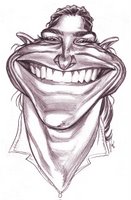
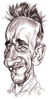
Hopelessly addicted to caricaturing at the moment...as if you couldn't have guessed. Here's more and their photos...
Monday, August 14, 2006
Boxhead
A caricature of fellow caricaturist Thor. The original idea I had for this was to photograpgh the pencil drawing (which was drawn edge to edge on a sheet of A4 paper), with some hair and goatee props overlayed onto the drawing, with the idea that the edge of the paper represented the outline of his head. Make sense? Anyway I decided (after not being to find any suitable hair props, and ruling out shaving the dogs), to just colour it as is. The boxhead outline idea is still sort of there, but it looks more like how another fellow artist descibed it, as if he had 'smushed his face on the scanner'.
Friday, August 11, 2006
Monday, August 07, 2006
What was he thinking...?!
Once again I decided to post a whole bunch of recent caricatures, but I wanted to approach it a bit differently. So with each caricature I'll try and explain my approach, what features I decided to exaggerate, how I progressed from start to finish. Hopefully it can give you all some insight into the many different ways I approach a caricature.
The people are all fellow caricaturists from over at The Drawing Board.
Click the names for their photo.
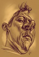
Toothsum- At first I thought this was going to be a tough angle to caricature, and in terms of capturing the subject's likeness, it was. The first feature I was drawn to was the seemingly tapered forehead with the little tuft of fringe perched on top. The distortion I wanted to go for was more like caricaturist Philip Burke's approach of not just caricaturing the obvious features but squashing and stretching the face for design purposes. That approach was possible for this caricature because I figured there wasn't much chance of getting a good likeness from the angle of the photo, so it freed me up to experiment more. I wasn't too worried about roughing the head shape first, but started with the hair and nose and let the other features eventually dictate the shape of the head. Being such a serious photo, there was no humour injected into the caricature. This was the reason for colouring, as it added more to the overall mood of the piece.
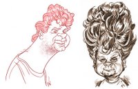
Don Flaws- I've caricatured a few of Don already, but when he posted up photos of one of his old hairdos, I couldn't resist doing another. His hair reminded me of former Hollywood child star Shirley Temple, so I decided to put him in a cute little dress and accentuate his hair ringlets. It's fun having this in contrast to his harsh facial features. This combination reminded me of the creepy children from the Aphex Twin music video clip 'Come to Daddy' and I had this in the back of my mind as I drew it.
JCPelly- Another tough one. JC has fairly normal looking features whose caricaturability aren't so obvious at first glance. For this, the headshape was the first feature I started with. With the hair and his chin, I came up with a crescent moon shape for his head and included the rest of the features around this. From another photo he included which was a profile shot, I noticed he had a long pointy nose, so I tried incorporating this into the three-quarter angle. He also has prominent muscles under his mouth and an Elvis-style sneer. He had photos with both glasses and without, so I omitted the glasses on this one so they didn't interfere with the headshape silhouette.
Erica- After the last sketch I did of Erica (see Caricature video) which I thought was quite unflattering, I decided to balance it out with something ultra cute. The whole caricature was based around her eyes and uniquely shaped eyebrows. Also the way the corners of her mouth drew up into her cheeks, were fun to exaggerate too. The hair was drawn ornately to frame the face and accentuate the eyes more. After all that effort, I still don't think I captured her likeness well.
Craig- This whole caricature was based around the shape of the mouth and the way the cheeks pushed up into the eyes. To people starting out with caricaturing, this can be the wrong way to approach it. When learning to caricature, it's best to start with the head shape outline and work inwards, rather than starting with a prominent feature (e.g. a large nose) and working outwards, as this can lead to the artist quickly running out of space on the page. (Thanks to Don for those pearls of wisdom) The eyebrows were added next, then basically everything else was fitted around them (luckily I still had enough room left)...and just to confuse matters, the outline of the face was the last things added in this pic.
Leopold- As soon as I saw this photo I had the idea of making him into some sort of monster (sorry Leo). The deep set dark-ringed eyes, the thin mouth jutting out with the lower teeth and the large gap between the nose and the mouth all led me to this decision. I changed the lighting when I drew this, so he seemed to be lit from below which added a more sinister feel. And I drew it in a comicbook style to accentuate the humour of the pic more.
So there you have it. If there's anything I left out, or if you have any other questions regarding my process, let me know.
Sunday, August 06, 2006
SHAZAM!
Some art I did for a Captain Marvel Superhero Jam over at The Drawing Board.
I inked this with a brush pen, and coloured it in Photoshop using the Colour Halftone filter to give it an authentic retro comicbook feel. I also shifted the colours slightly and lightened the pure black to give it an aged look.
Thursday, August 03, 2006
100th post...yay!
I had this entry put aside for something special, but I've been so swamped with work lately I haven't had time to do what I intended. So instead I'm posting up...you guessed it- more caricatures. I've been gradually pushing them stylistically further and further, experimenting more. A lot of fun.
...and here are the poor sods who fell victim to my poison pencil.
All artwork © Chris Wahl 2019 unless otherwise stated.
All characters are copyright to their respective owners