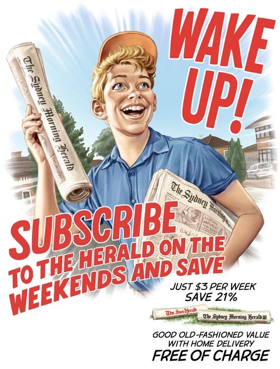
This is a job I did earlier this year for The Sydney Morning Herald. I'll be taking you through step by step from rough to final, explaining one of my very easy 'painting' methods (and I use that term loosely) along the way.
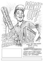
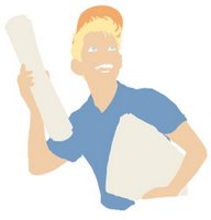
The brief was to have a classic 50's American style paperboy promoting the paper's subscription offer. I provided this rough sketch indicating the pose and the positioning of the text (which I was also doing) for the layout of the leaflet.
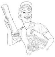
They initially were expecting a more cartoony style as indicated in my rough, but to achieve the 1950's look, I wanted to go for a bit more realism. Using photo reference of paperboys and also myself (don't ask), I created this line drawing.

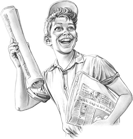
The next step in my process was to completely shade the drawing in pencil. This is the most important and time-consuming step in my 'painting' process as you'll see later.
I scan this drawing into Photoshop, and with the drawing on a separate layer, I create some flat colours. The grey pencil is also colourised to match the flats.

Next step is to add highlights and a few shadows to the colour layer (most shadows are already indicated with the pencil.)
Once that is done I take the flattened artwork into Painter Classic. Now this is where my painting comes to life. Think of it as using water with Watercolour pencils to create a painting.
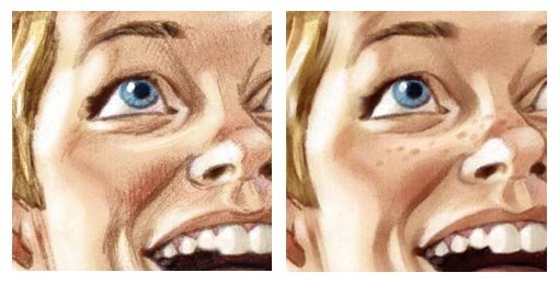
Using the 'Just Add Water' tool, I blend the pencil work into the colour work to create a smooth painterly look.
Since all the hues and tones are already worked out, you can work pretty fast, which achieves quite a good spontaneous look. Also the opacity is set fairly low, so a little bit of the pencilwork shows through to retain that organic, hand-drawn feel.
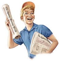
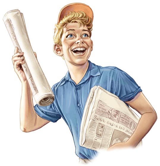
Once that stage is over, it's back into Photoshop, where I add the newspaper titles, do any colour corrections and finally add some noise to the pic to dirty it up and reduce the digital feel.
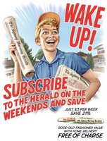
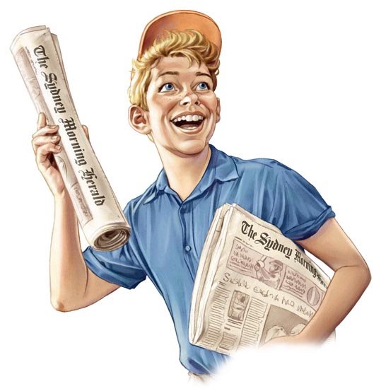
Finally the background (which was created using a similar method as above), the starburst effect (which involved creating a radial blur mask) and the text (hand-drawn, scanned and coloured in Photoshop) were added for the finished pic!
Hopefully this is a helpful insight into one of the ways I create my work. It's a very simple method, and is good for people lacking in traditional painting skills...like me.